Yet another article about design vs. art
This is my thinkpiece on the difference between design and art. There are many like it, but this one is mine.
There are hundreds, if not thousands, of think pieces out there about what is design, and what is art, and how they overlap (or don’t). Can art exist without design? Can design exist without art? Is graphic design art or is it design? Does art have a role in UX design?
The world hardly needs another article on this topic, but I feel like if I’m going to have a blog about design, I should make it clear what my stance is here.
First up: Design.
Design is the reduction of friction
This is another way of saying that design is about removing all the things that make something not work as well as it could. In user experience design this means making something easy to use by removing everything that makes it difficult to use. There are millions of articles out there about how this works, but design isn’t just about usability. There are other kinds of friction that can be eliminated with creative design — including literal friction.
I recently bought a Nissan LEAF electric car. As you can see in the picture below, it has a couple of really funky looking raised headlights.

Those funky headlights aren’t purely stylistic. They’re designed to reduce drag over the side mirrors. Both mileage and safety are important to car manufacturers. Since side mirrors can’t be eliminated or made perfectly aerodynamic, a creative designer found a way to use a completely different car part to mitigate one negative impact of their presence.
Design can also be used to reduce friction in marketing. In marketing, friction is anything that prevents a user from selecting your product over a competitor’s. A marketer’s goal is to make the decision to use their product as close to a “no-brainer” as possible.
If I’m considering two different restaurants and one offers online reservations and one doesn’t, I’m almost always going to choose the one with online reservations. This may not truly be “in my best interest” (maybe the food at the other place is better), but I absolutely hate feeling like an idiot when I call for a reservation just to find out they’re booked for weeks. That’s friction a restaurant needs to remove if they want to do business with me.
What about Graphic Design? Is Graphic Design… design? Or is it art? That’s where the art vs. design debate tends to get pretty heated. My take is that it’s a little bit of both, but it’s mostly art. So let’s define art:
Art is the use of craft to tell a story
Entire college courses and entire careers are dedicated to defining art, but in actuality most discussion centers around what makes art good or bad. I am not qualified to have those discussions. I stick with a definition that makes no judgments about quality.
All art is story telling. An artist wants to make you feel or think something, so they tell a story they hope will get that reaction. It doesn’t have to be a literal story. It can be a mood created by clever use of typography or colors (or interpretive dance, or music, or architecture). It can be a feeling of wealth and success created by selecting exotic materials for a luxury car.
Design always solves problems. Art doesn’t have to. Sometimes art’s only goal is to make someone think “Wow, that’s weird.” If art gives the viewer/listener/reader the thoughts or feelings the artist intends them to have, then it’s successful. Design is about the goals of the user. Art is about the goals of the creator.
How design helps art
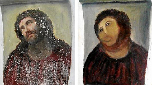
Artists use design to create art. If art’s goal is to tell a story, the job of design in art is to reduce the friction in getting that story across. The most common design tool in art is technical skill. If you want people to understand the story of Swan Lake, you need to be able to dance. If you want to tell a visual story about the passion of Jesus Christ, it helps to be able to draw an accurate representation of Jesus (or at least of a human being).

Ecce Homo, a 1930 painting “restored” in 2012 by amateur painter Cecilia Giménez
But art can also make use of clever design decisions unrelated to technical skill. Mark Rothko is famous for extremely simple (looking) paintings containing nothing but large fields of color. There’s little story that this type of painting can tell beyond setting a mood.
Rothko’s paintings are large. If a painting’s goal is to set a mood, it’s much easier to set a mood with a huge wall of color than with a postage stamp. The size of his paintings was a design choice made by Rothko with the goal of reducing friction in setting a mood.
How art helps design
It’s almost impossible to create a successful experience that doesn’t tell a story. Human beings are not rational creatures. Science has proven repeatedly that human decisions are driven by emotion, not logic—even to the extent that people with damaged emotional centers in their brains are incapable of making decisions. People are influenced by stories.
Particularly in the consumer world, stories drive purchasing decisions. When you buy a Ralph Lauren polo shirt, you aren’t buying cotton and thread, you’re buying sunny afternoons playing croquet at the country club. When you buy a Lexus, you’re not buying four wheels and a engine, you’re buying a corner office, power lunches, and a killer golf swing. These stories help marketers sell products. If these stories speak to you, they reduce the friction that would cause you to buy something else. When it comes to selling products, these stories are just as important as good UX design on the respective companies’ websites.
I recently came across a Medium post entitled “Well-designed interfaces are boring.” I respectfully disagree. Firstly, Donald Norman famously demonstrated that attractive things work better. Why? Because we feel more relaxed around visually appealing things. This state of relaxation encourages us to explore alternative ways of using something, whereas a state of tension causes us to give up in frustration.
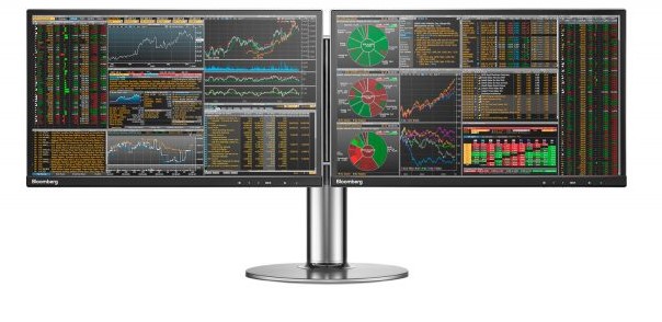
Secondly, the primary example author Matthew Ström gives as a boring interface is the Bloomberg Terminal. You know, one of these things:

He’s right that every design aspect of this thing was chosen for a good reason but — I’m sorry — this thing is not boring. Sitting in front of this terminal would make me feel like I’m an all-powerful wizard controlling the universe! That’s a hell of a story that’s going to affect the way I think and act. Based on the reputation of elite Wall Street bankers, I’m pretty sure that’s the desired (and proven) effect.
Good design does not need to be boring. Good design should not be distracting, but that’s absolutely not the same thing.
Lets talk flat design (of course)
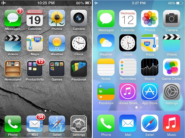
Nothing has fired up the art vs. design debate more than the twenty-first century “übertrend” of flat design. Is flat design devoid of art? Is flat design devoid of design? Either way, are we better or worse off?

iOS 6 vs. iOS 7
Well, let’s see how flat design fits into my two definitions of design and art.
Proponents of flat design believe that it removes friction by eliminating distracting UI details. But detractors believe that it adds friction by making it harder to decipher content hierarchies. I believe that both flat and non-flat design can have non-distracting UI’s and clear content hierarchies if done well. So, I don’t find either style inherently superior — from a UX perspective — but there is clearly a design strategy behind each.
The other argument flat design fans make is that flat design is somehow more “natural” for a screen-based interface, that it’s somehow more authentic and real.
If that’s not storytelling, I don’t know what is. There’s no such thing as an “authentic digital experience”. Humans invented computers and they invented display screens. Saying that there’s one “authentic” look and feel for screens is like saying there’s only one “authentic” way to build a table. Like screens, tables don’t exist in nature. Tables can be made of wood, plastic, metal, glass, or iron. There is room in the world for all of these, and the ideal table at any given moment depends on intended usage and fashion trends.
Flat design is absolutely an artistic choice and by no means some kind of platonic ideal of visual design.
I believe we exist in an endless cycle of flat vs. intricate design. Some believe intricate-to-flat is a one way street. If so, how did we go from Swiss design to grunge, then back to flat design? Intricate design will be back. There is far too much craft and elegance in graphics like 2010-era OS X icons for their likes never to grace our eyes again.
![]()
Mac app icons from 2010
Can’t we all just get along?
There is room in the tech world for art and design. There is room for designers who are good at art and for artists who are good at design. There is also room for designers who aren’t good at art and artists who aren’t good at design — as long as they collaborate well with their counterparts. Art and design are both tools. They’re independent yet highly symbiotic. If you want to build something great, strive to make use of the best design and the best art available.