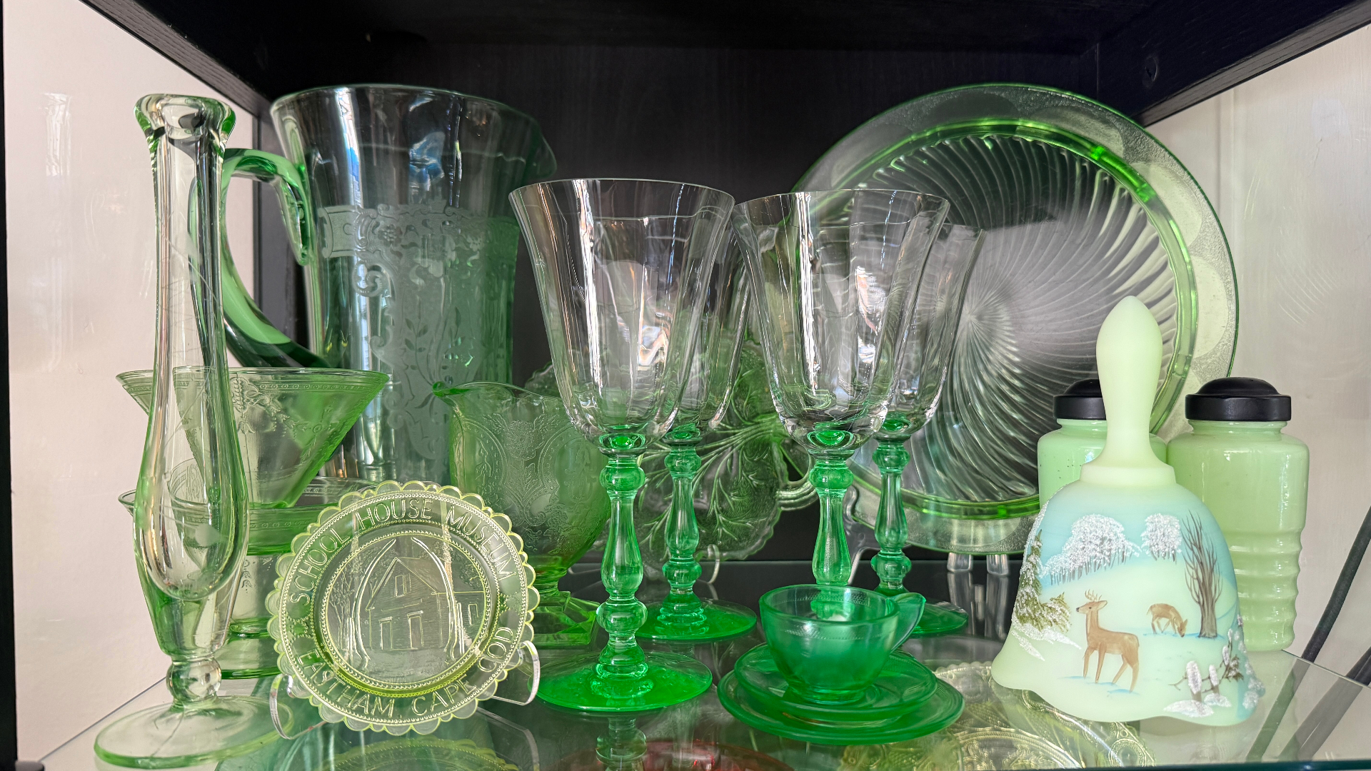
Trésora was inspired by my wife's fascination with uranium glass — the vintage glassware that glows electric green under UV light. That fascination quickly grew into a lifestyle — a path shared by many collectors of antique and vintage items. I built Trésora as a companion app for people like her who love the thrill of the hunt and want to keep track of their growing (or overflowing) collections.
Most collectors keep track of their finds in boring, ugly spreadsheets or on scraps of paper — if they keep track at all. I wanted to create a beautiful and fun-to-use tool that celebrates a user's collection and doesn't feel like work.
The premise
The person I'm building for is the weekend "treasure hunter" – visiting antique malls, thrift stores, estate sales, and the occasional yard sale. They may sell some pieces here and there, but they're not a dealer running a business – they're a hobbyist who's in it for the love of the hunt. And this type of weekend treasure hunting has three distinct moments that no single app was serving well:
- Figuring out where to go.
- Learning what something actually is — and what it's worth — while you're standing in the aisle holding it.
- Keeping track of everything once you get it home.
Designing the brand
Existing apps that target antique collectors (mostly an endless stream of copycat "one-trick" identification apps) tend to look like antiques themselves — all faux parchment, distressed leather, and fussy old serif fonts.
It's a cliché, and these apps' designers (mostly out for a quick buck) don't understand today's collectors at all. Many of today's vintage and antique collectors are young, and they spend all day in modern, well-made apps. The things they collect are old; the app doesn't need to be. The look and feel of the Trésora brand was designed to capture the joy and excitement of collecting, not the look and feel of the collection itself.
A false start that led to increased focus
This is actually the second iteration of Trésora. The first was a web-based platform that I spent three months building and ultimately abandoned. Why? Well, I wrote an entire newsletter post about it. In short, I got so caught up in the power of building with AI that I temporarily forgot the most important lesson in UX design: a relentless focus on who your user is and what they actually need. I created an app that tried to be everything to everyone and ultimately wasn't a great fit for anyone.
But building the wrong thing made it crystal clear to me what the right thing should look like.
My role
Everything. Product management, design, brand, copywriting, engineering, QA, and go-to-market: the name, the positioning, the visual identity. The information architecture, every screen and interaction, the native build, the data model, the AI identification pipeline, the subscription system, the marketing site, the help docs, the support setup. Everything I learned throughout a 30+ year career spanning design, development, project management, and marketing went into this app.
The decisions worth talking about
The objects are old; the experience isn't
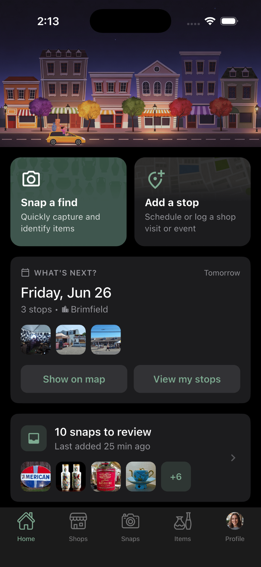
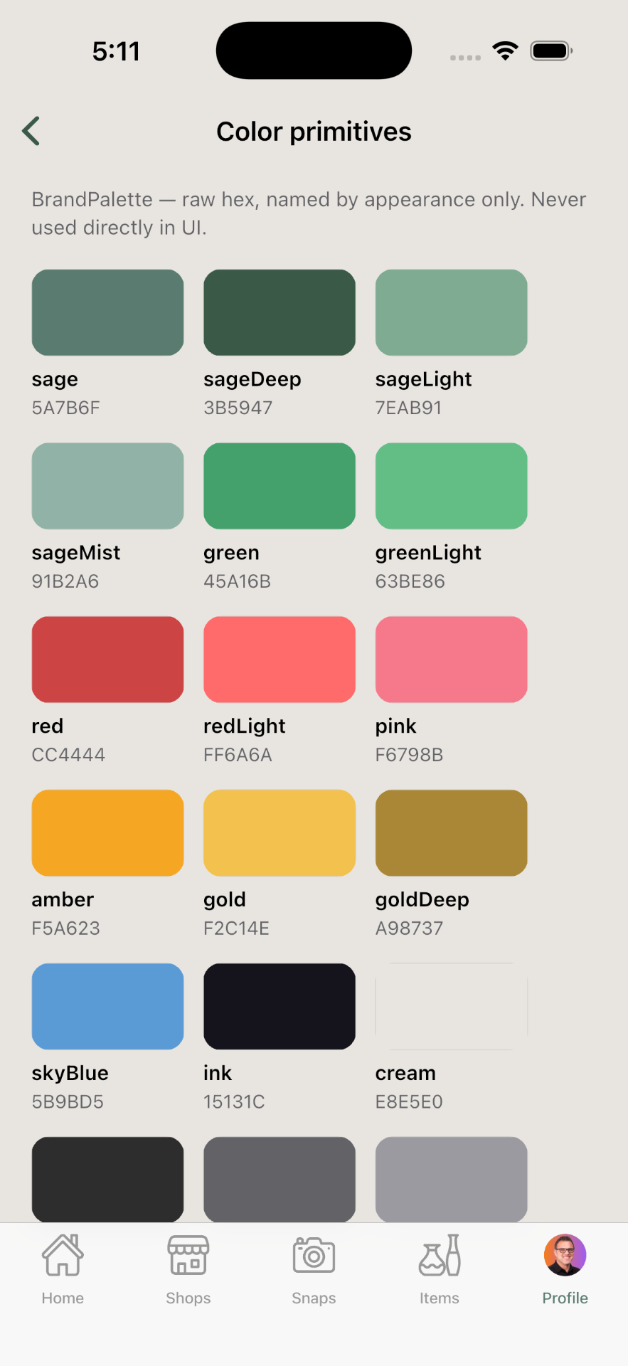
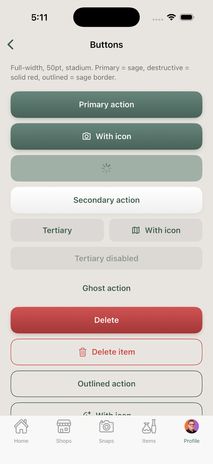
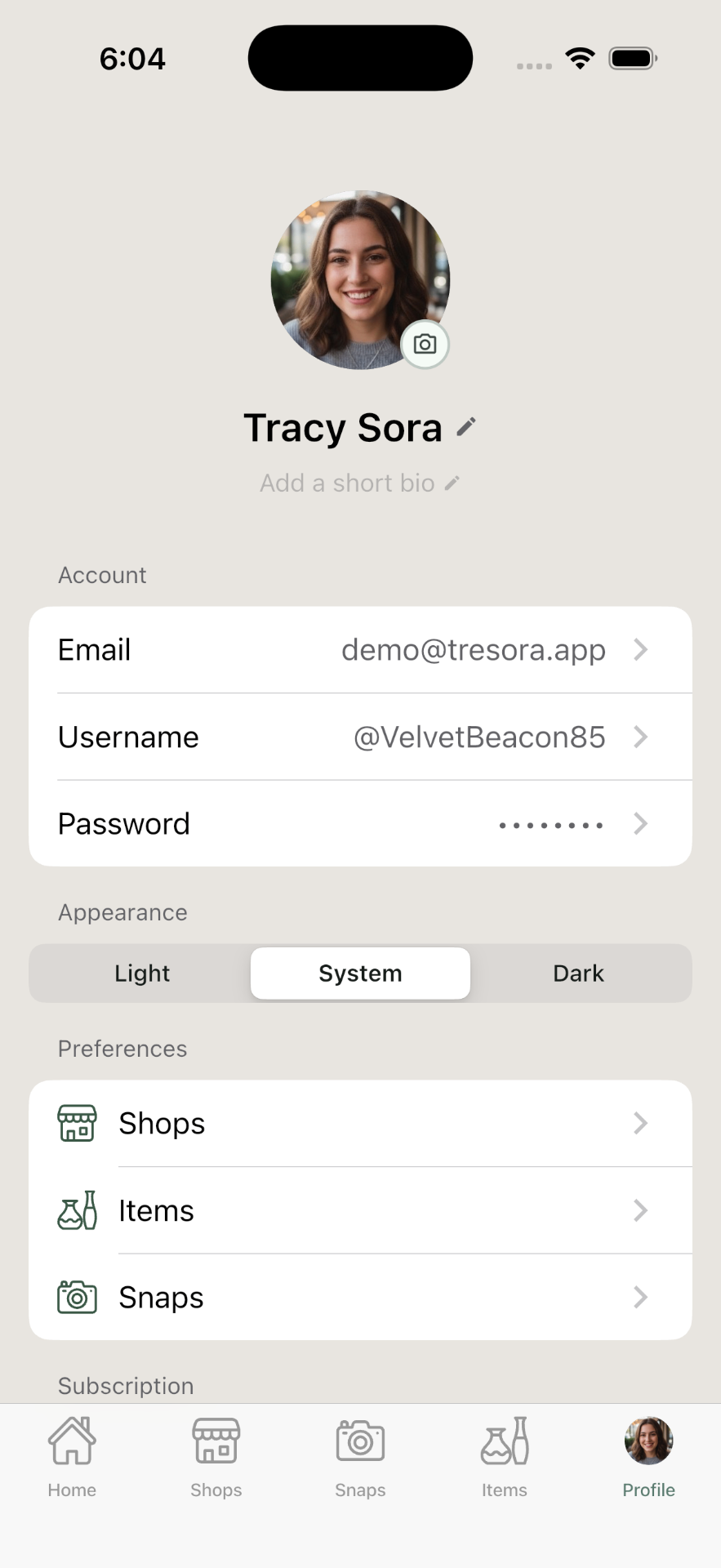
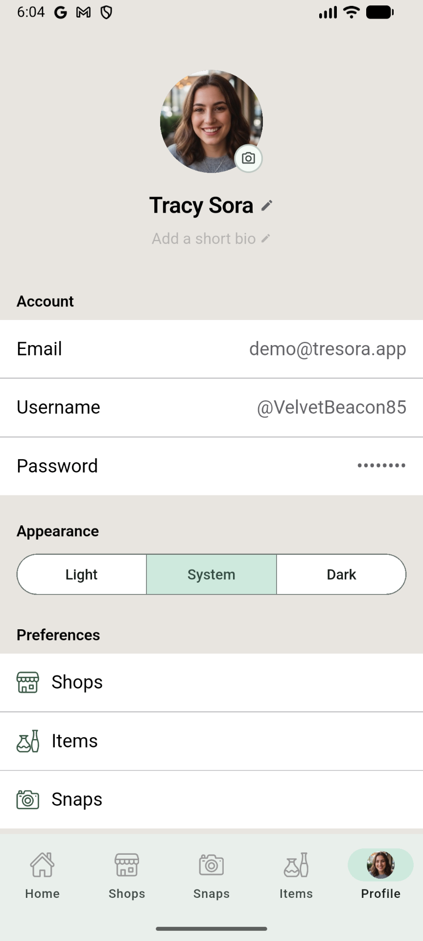
Creating the visual system for Trésora took one discipline above all: restraint. No fake parchment, no wax seals, no ornate script fonts. I also wanted a visual style that didn't feel overly feminine or masculine — landing on a warm, modern palette built around sage green and warm neutrals. Enough character to give Trésora a real personality, but clean enough to be the type of app you "live in," not a gimmicky novelty app.
Three modes, connected in any order
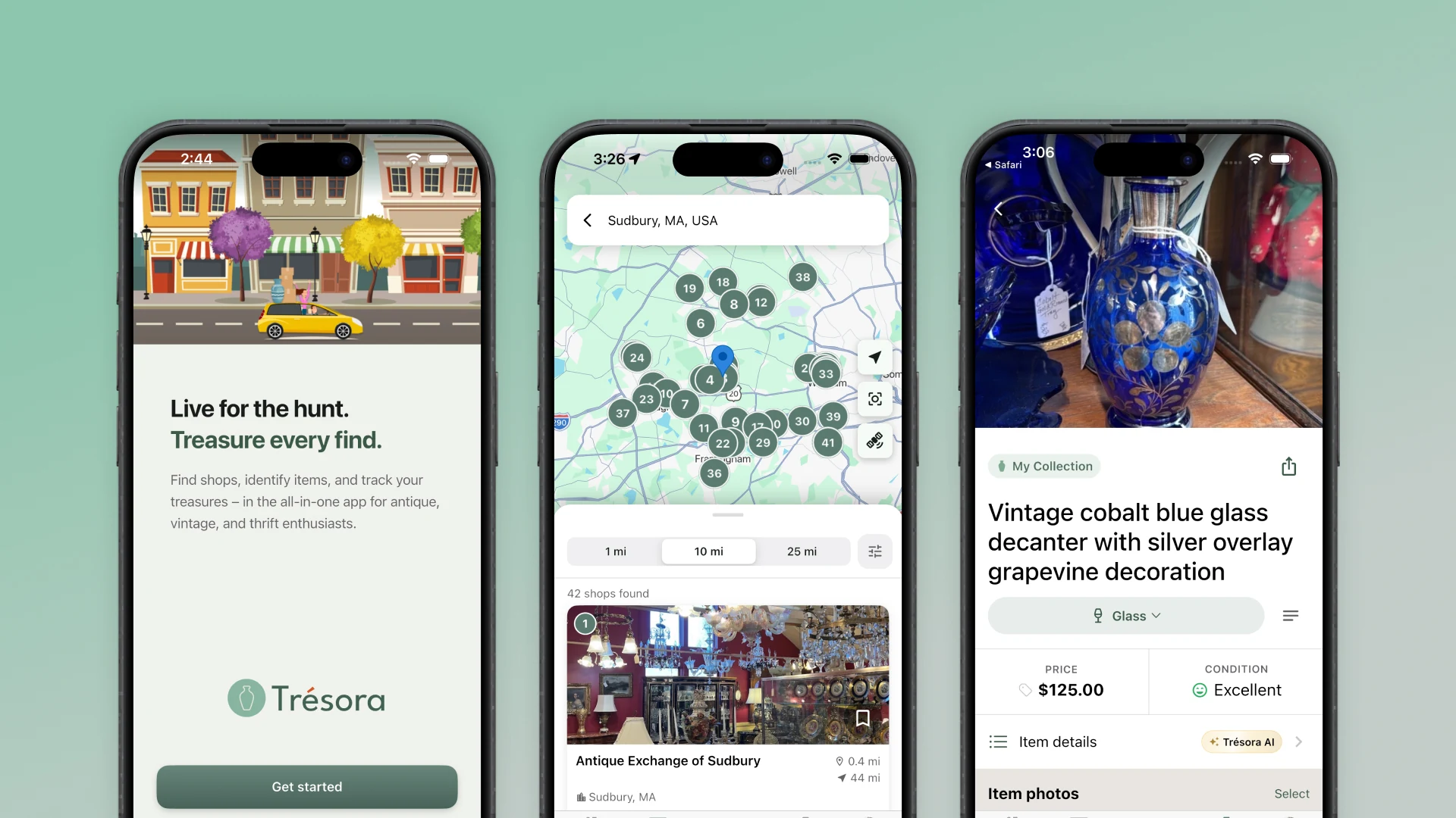
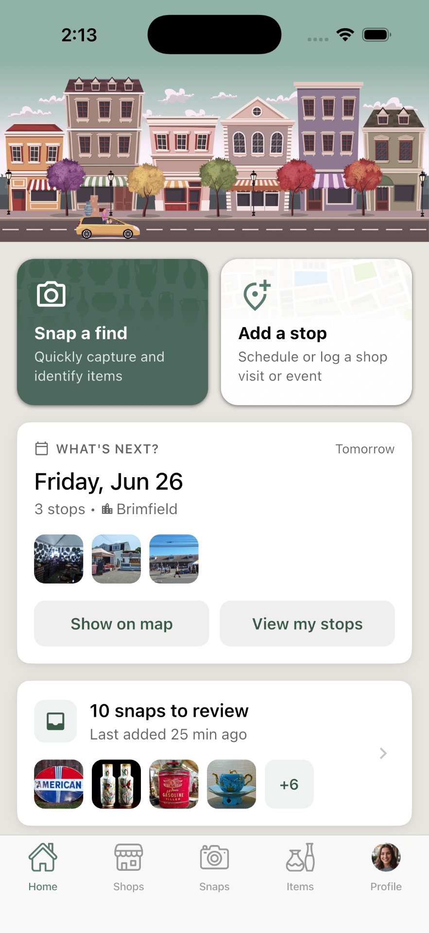
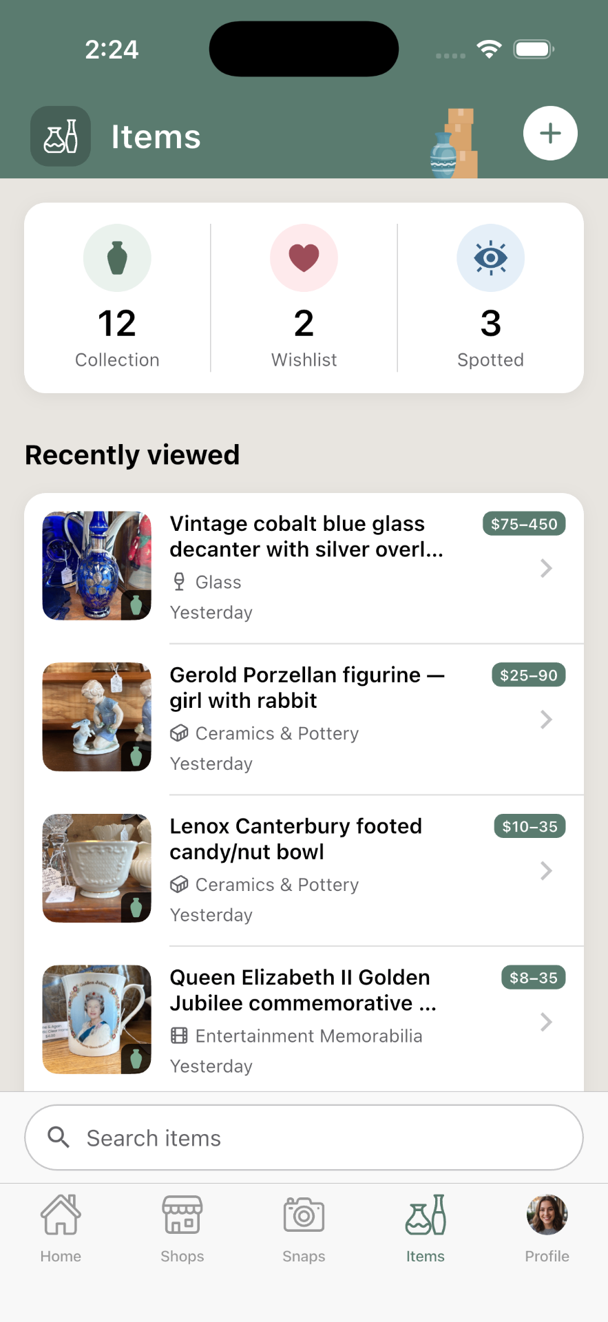
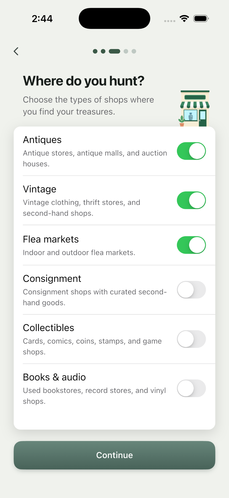
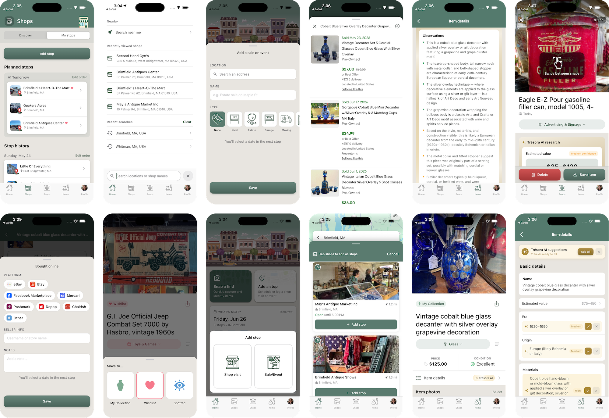
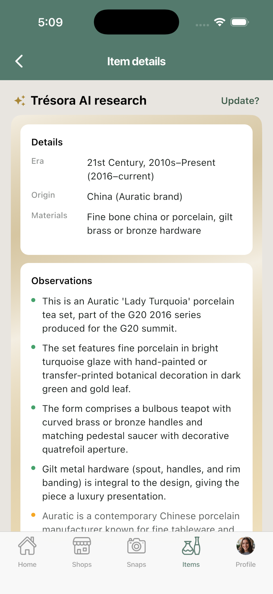
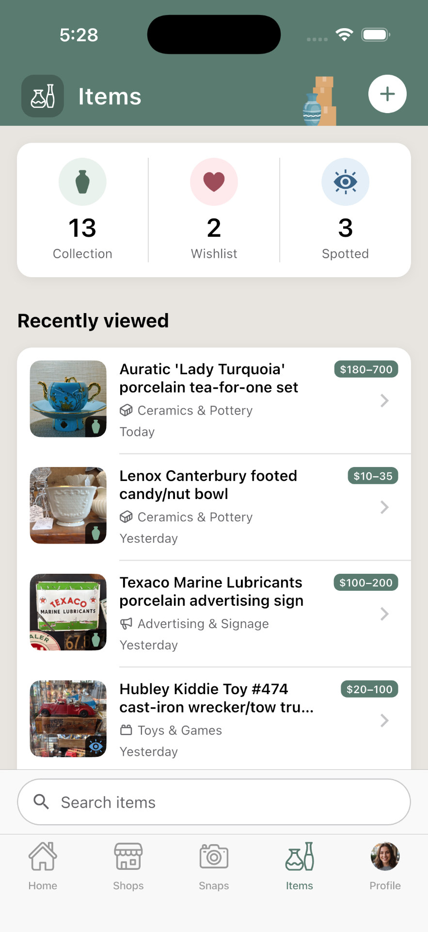
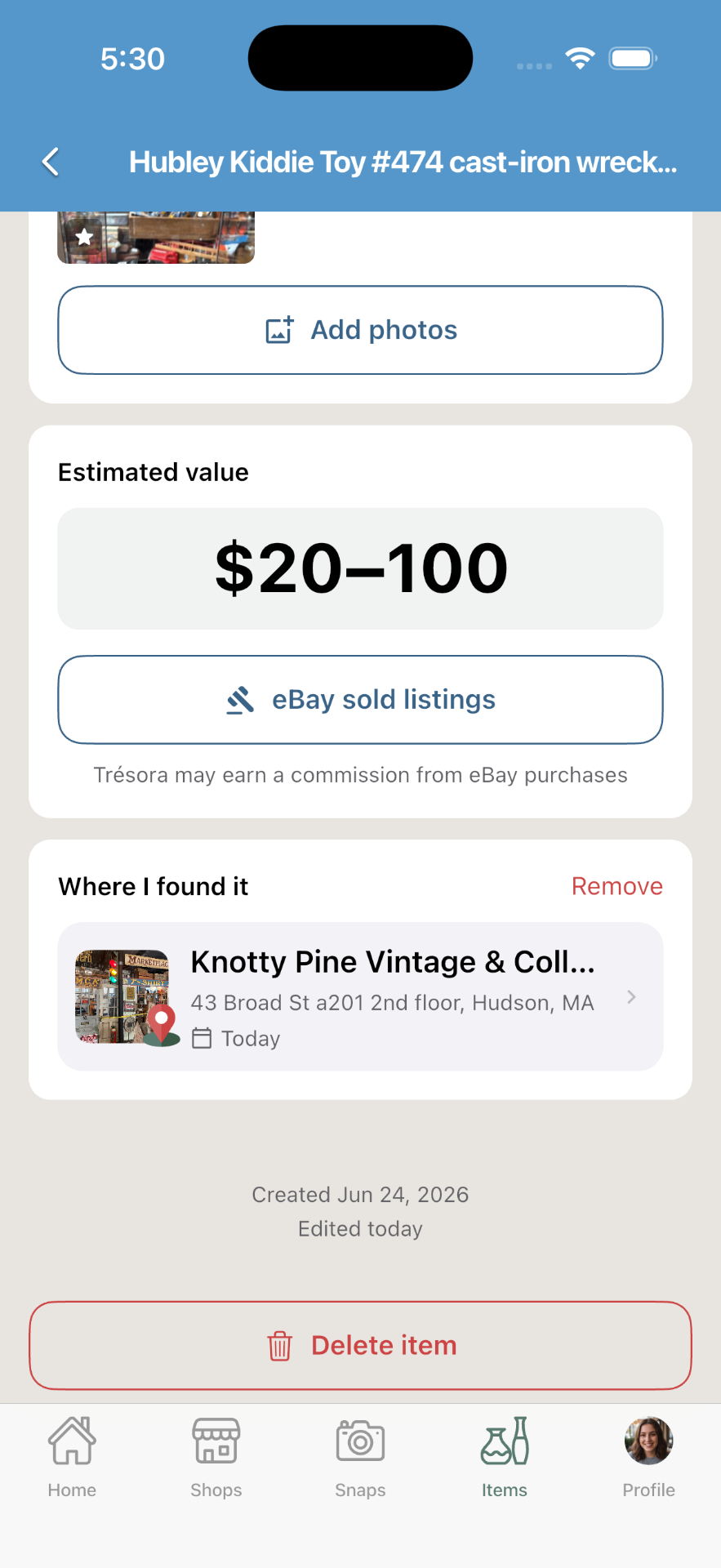
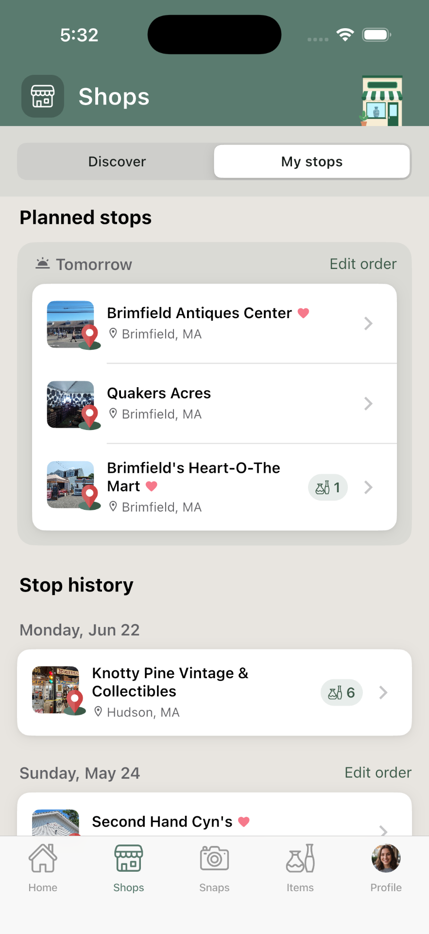
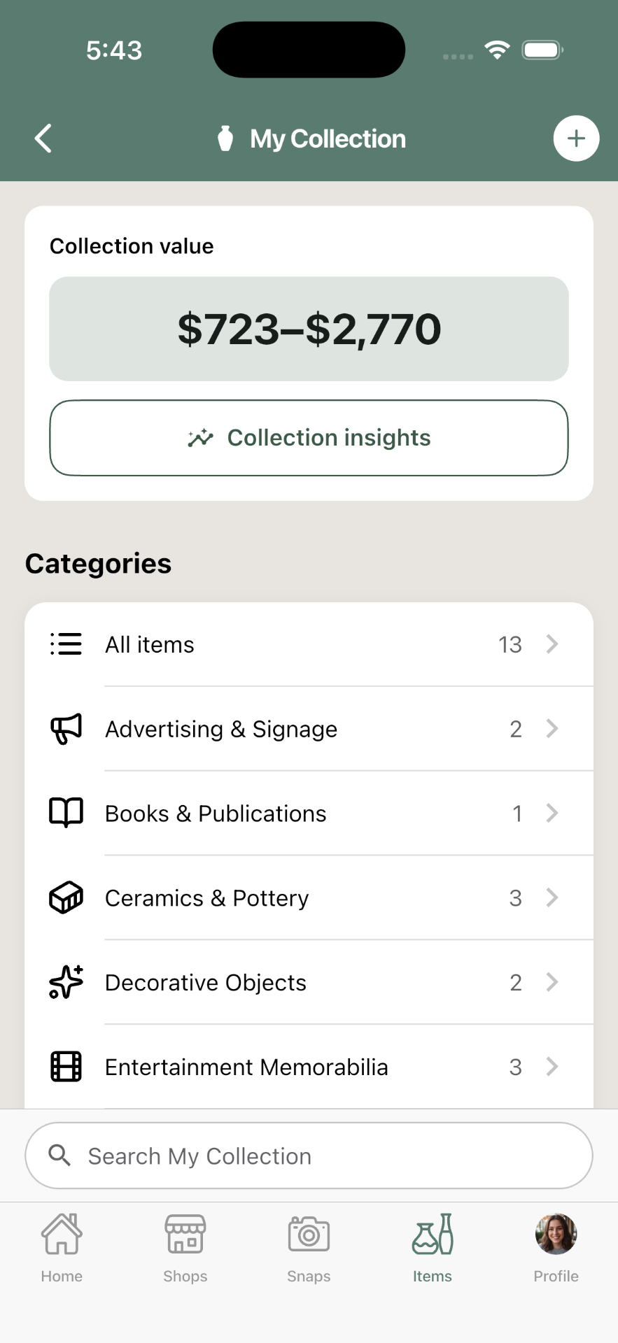
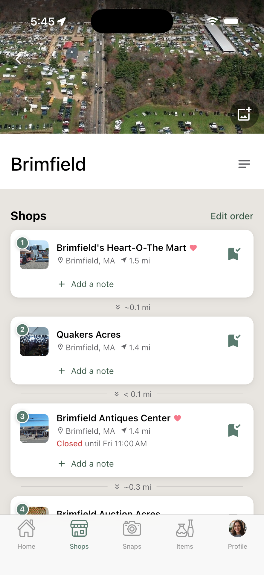
The app is structured around three core elements. Snaps is your inbox — capture and identify cool things as you see them, without worrying about how to organize them. Stops are dated visits to shops or events like estate sales. Items is your library — not just what you bought, but also a visual memory of cool things you've found, and maybe put on your wishlist.
What really makes Trésora a fluid experience to use is that all of these elements can be connected in whatever order works for you.
I learned how much this mattered while doing "field testing." I originally designed the flow around planning out a trip in advance and then attaching finds to the stops you planned. Then I wandered into an unplanned shop, saved a find, and hit a wall — no way to quickly add a new stop in that moment. The flow felt right at my desk and wrong in the shop. When I got home, I immediately updated the app with that insight. The principle — the app bends to the user's order of operations, never the reverse — came straight out of using the app where it's meant to be used.
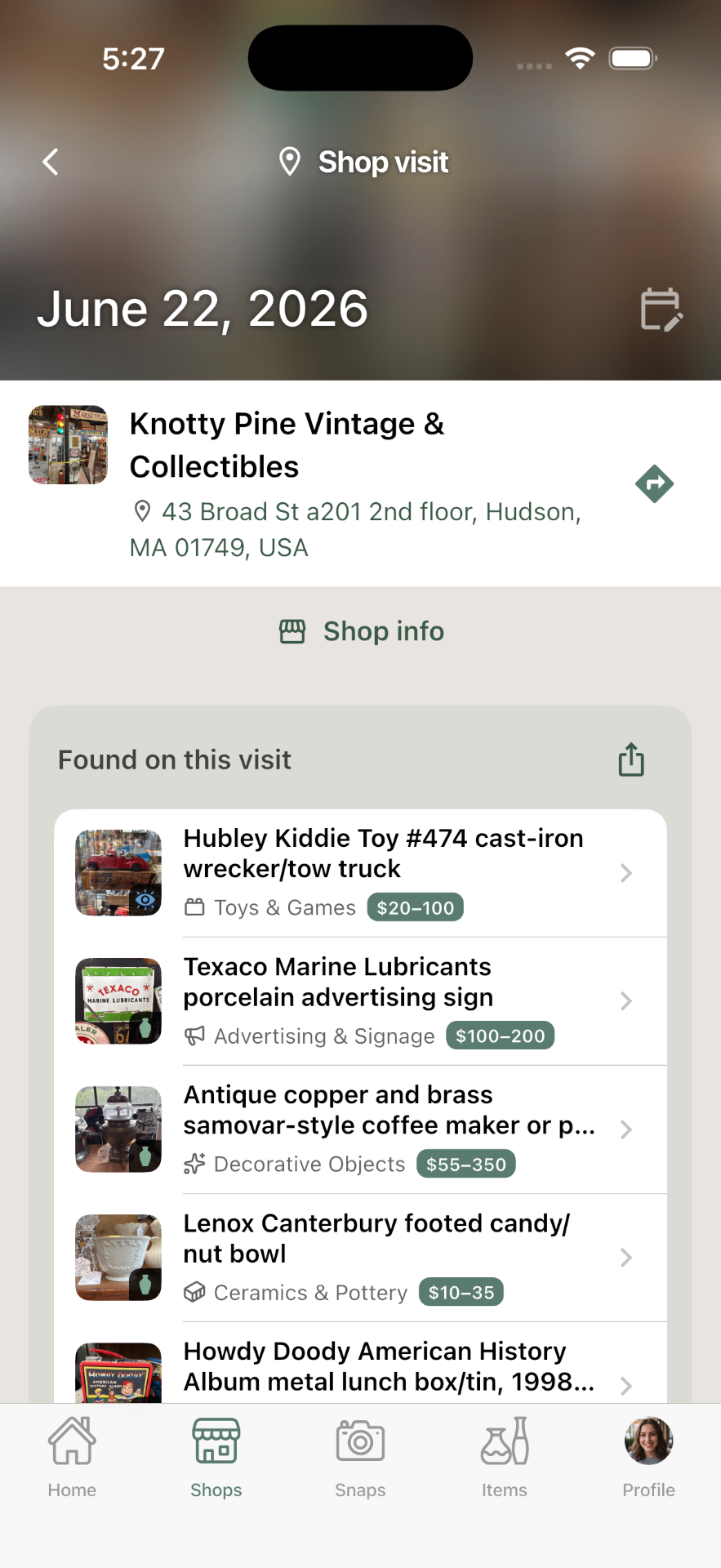
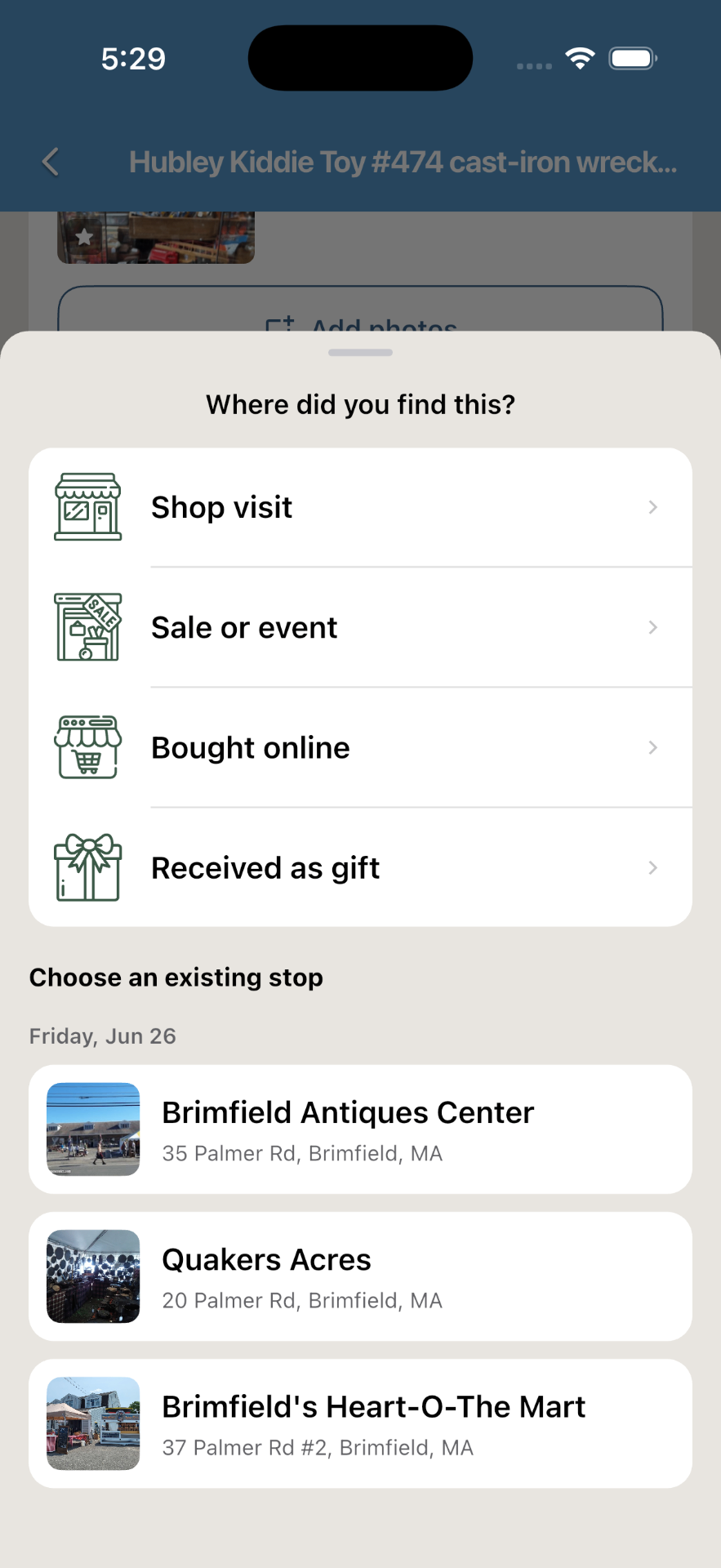
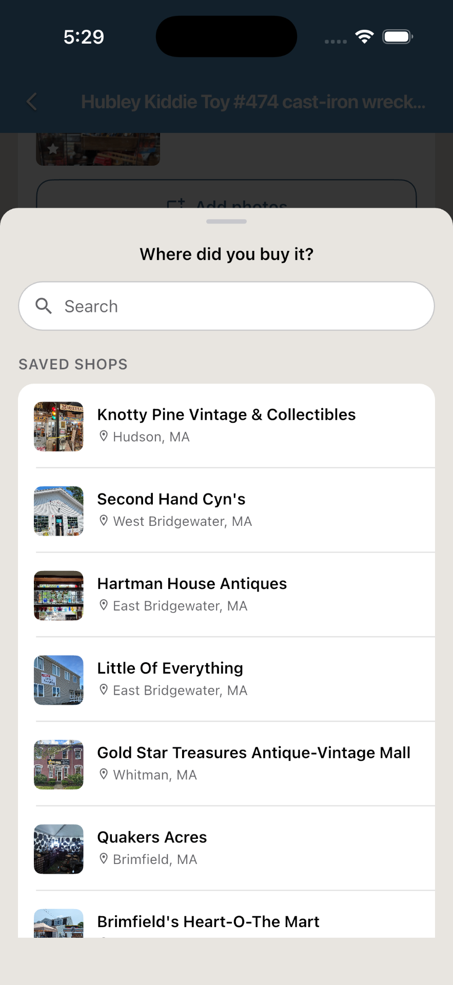
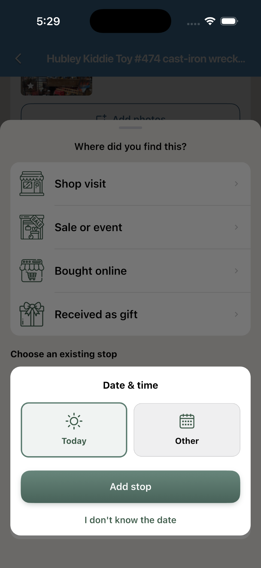
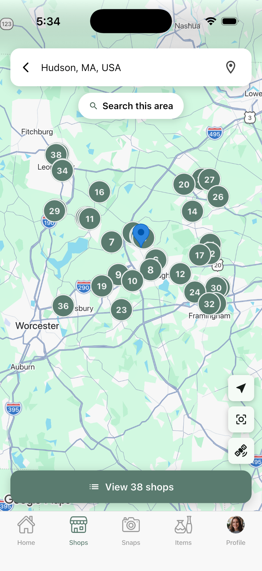
The Stop planner — the part no one else builds
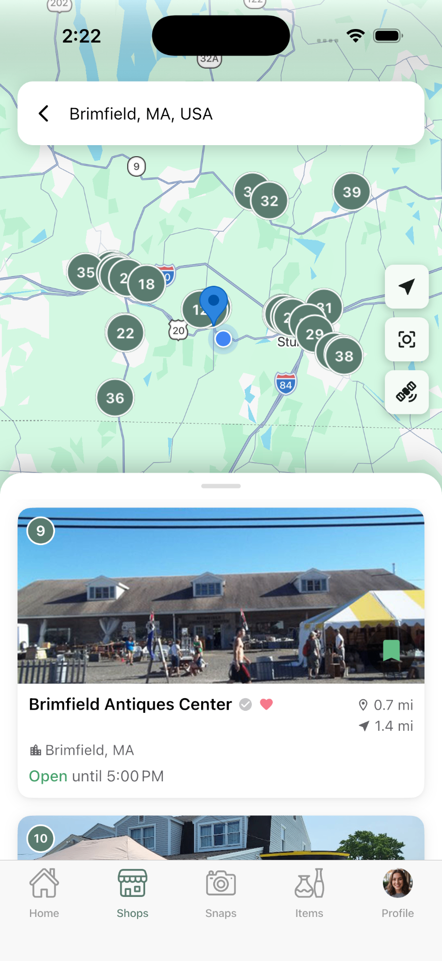
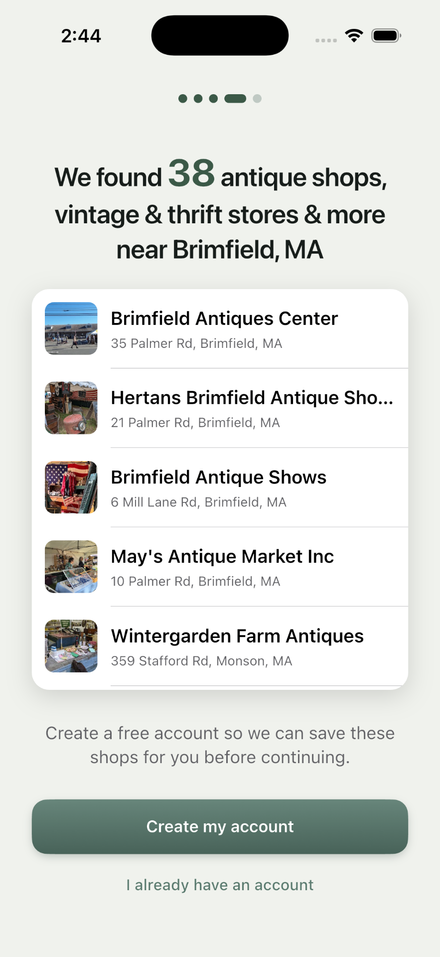
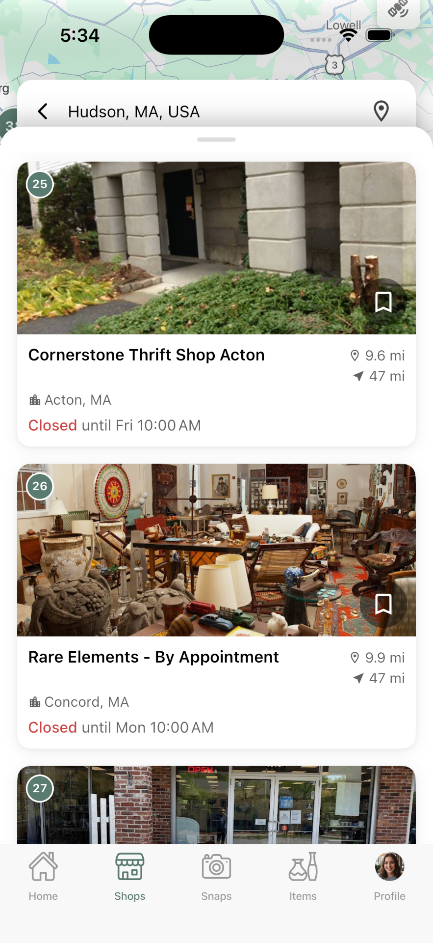
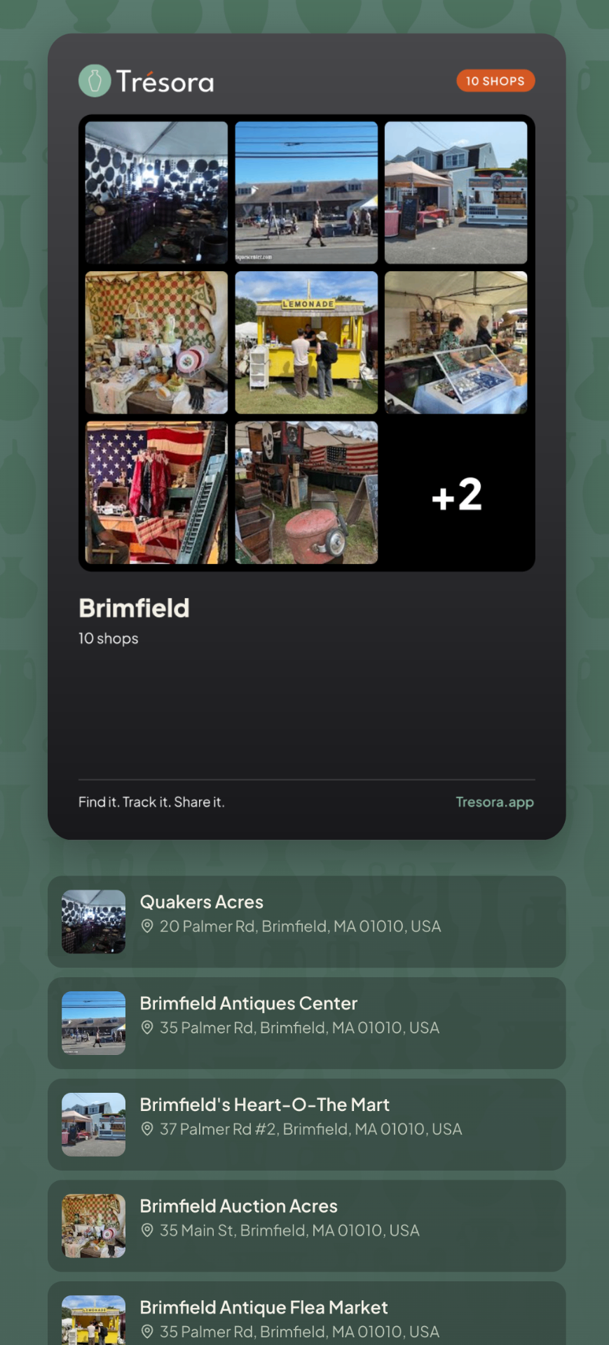
Every collecting app I could find helps you catalog what you already own. Almost none help with the part of the hobby that happens before that: deciding where to go, and connecting your finds back to those shop visits. The Stop planner is truly unique to Trésora — plan a route of shops, capture finds while you're there, and keep a living map of the places you want to go next.
I have big plans for this part of the app, once a community of users truly gets established — shared finds, reviews, and the local knowledge only regulars have.
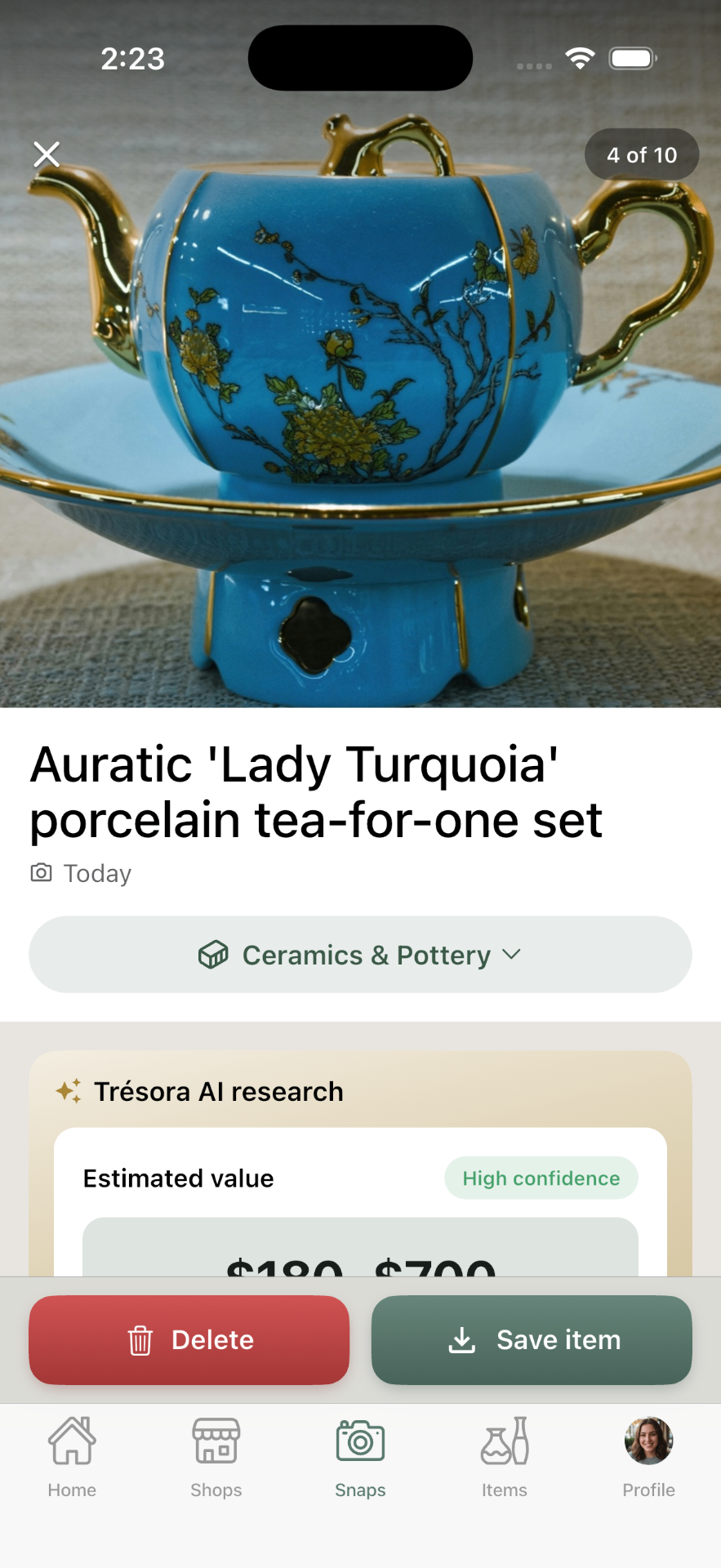
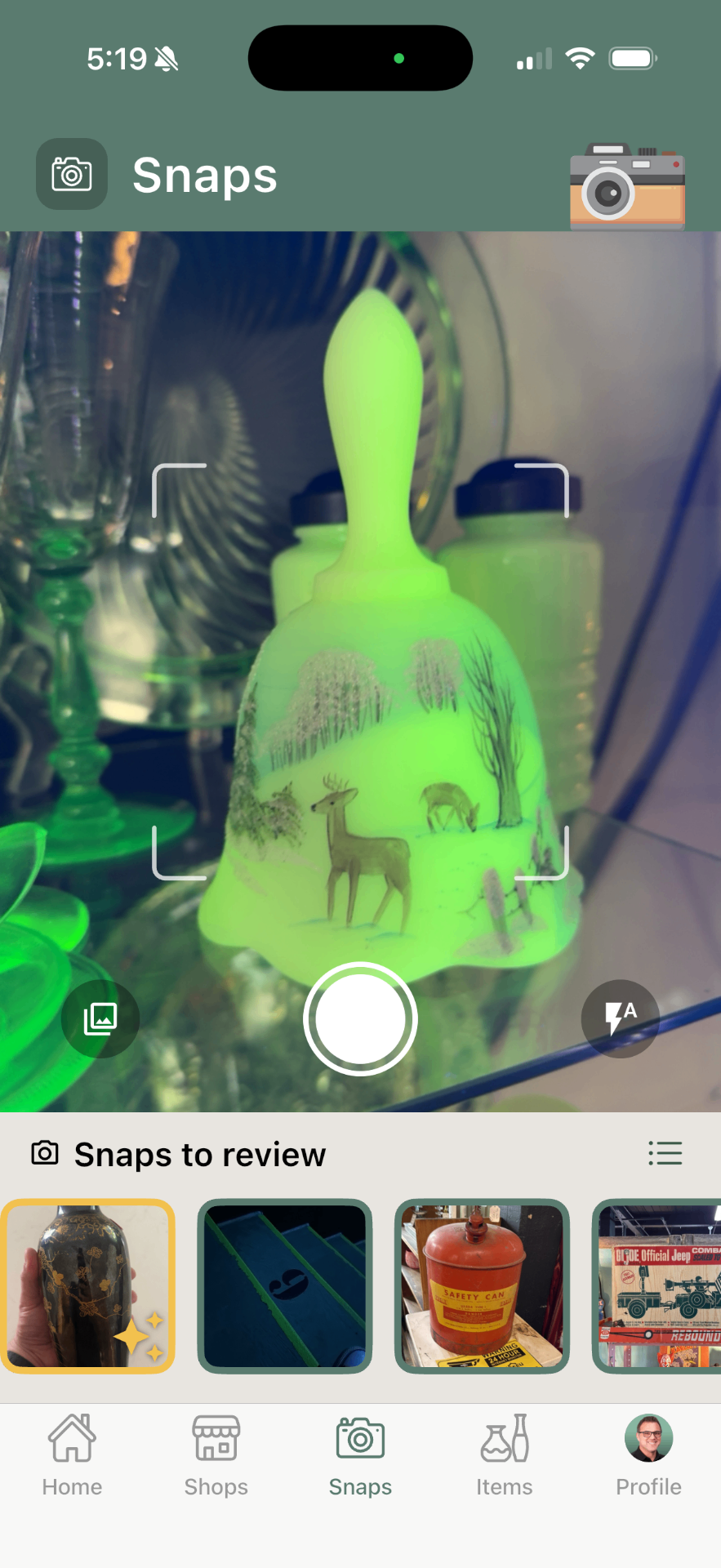
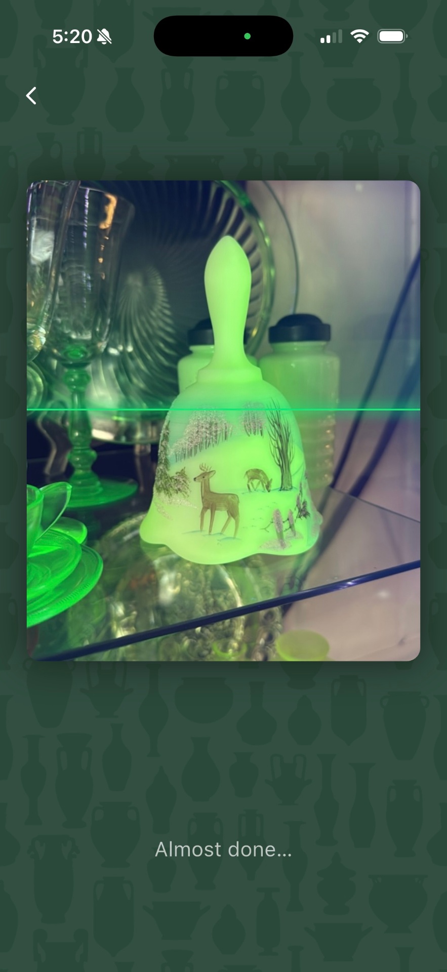
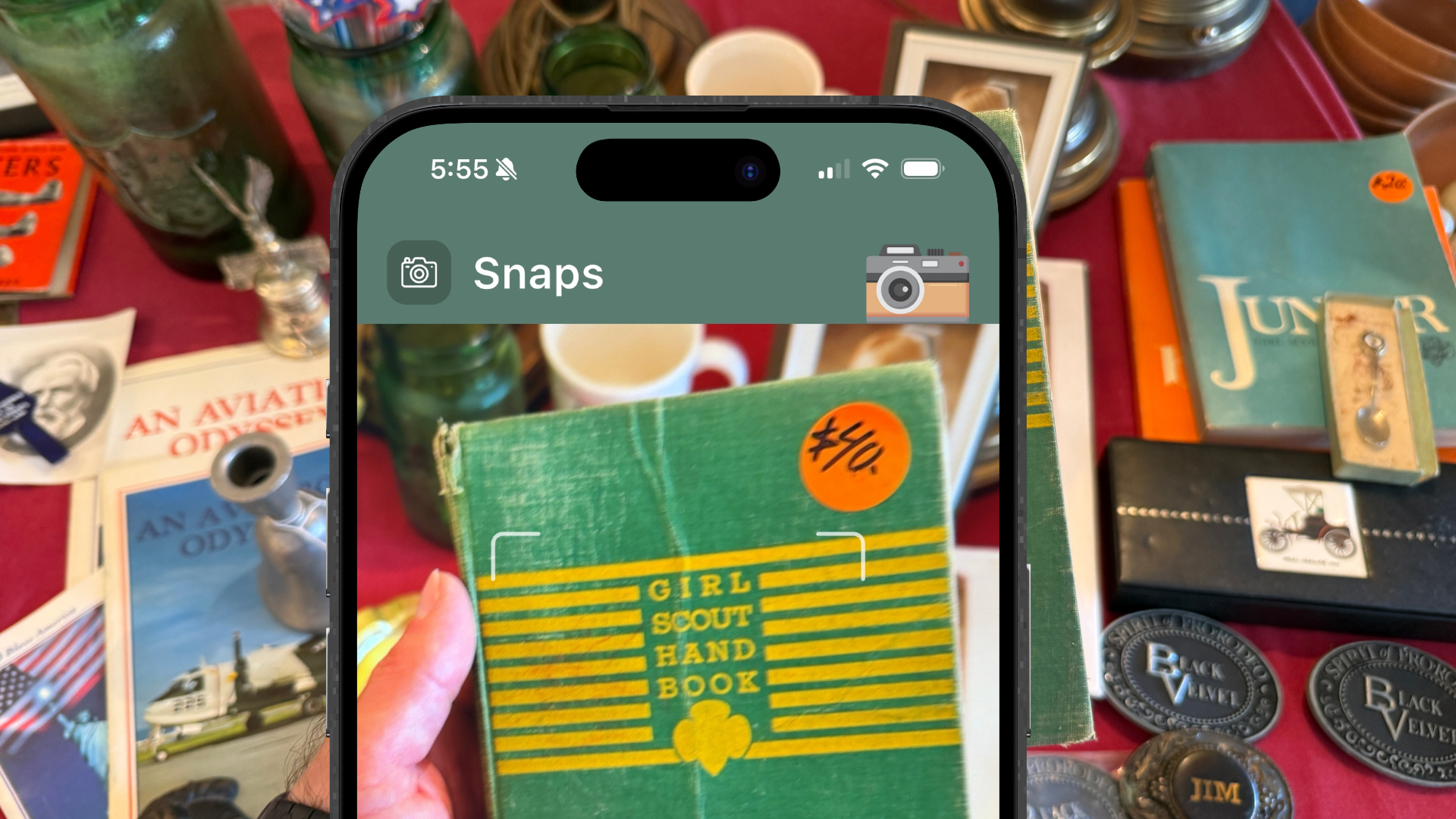
Point your phone at the past
Every "treasure hunter" knows the moment — you spot something in a tucked-away corner of a shop that seems like such a good deal, it must have been mispriced. Your adrenaline starts pumping as you wonder if you're about to make a major score, or if you're actually looking at a reproduction, or a specific design of something that isn't as rare as you think.
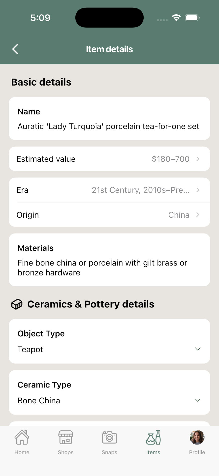
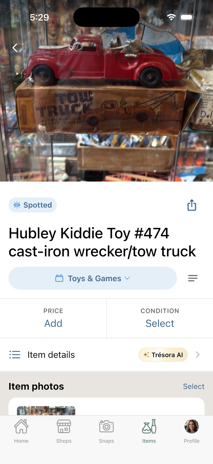
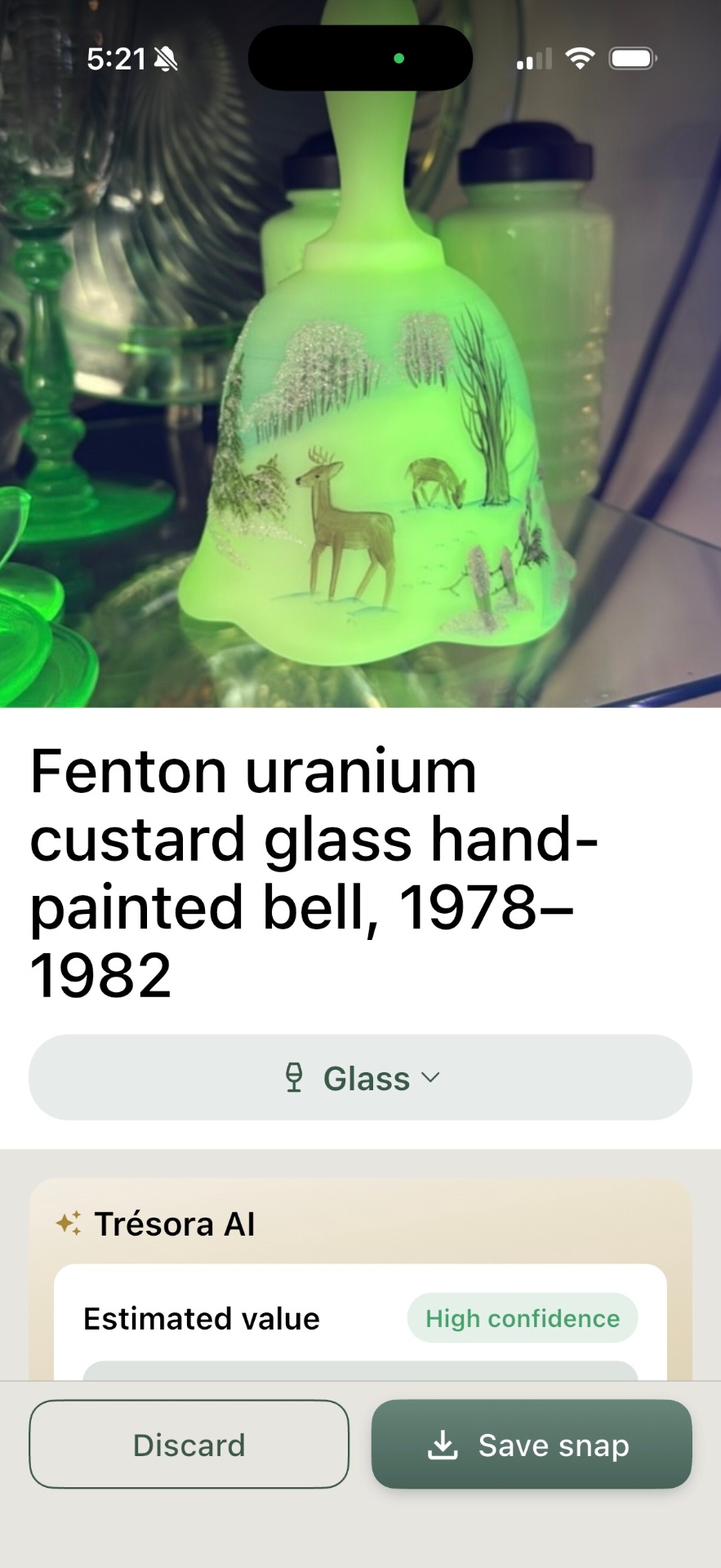
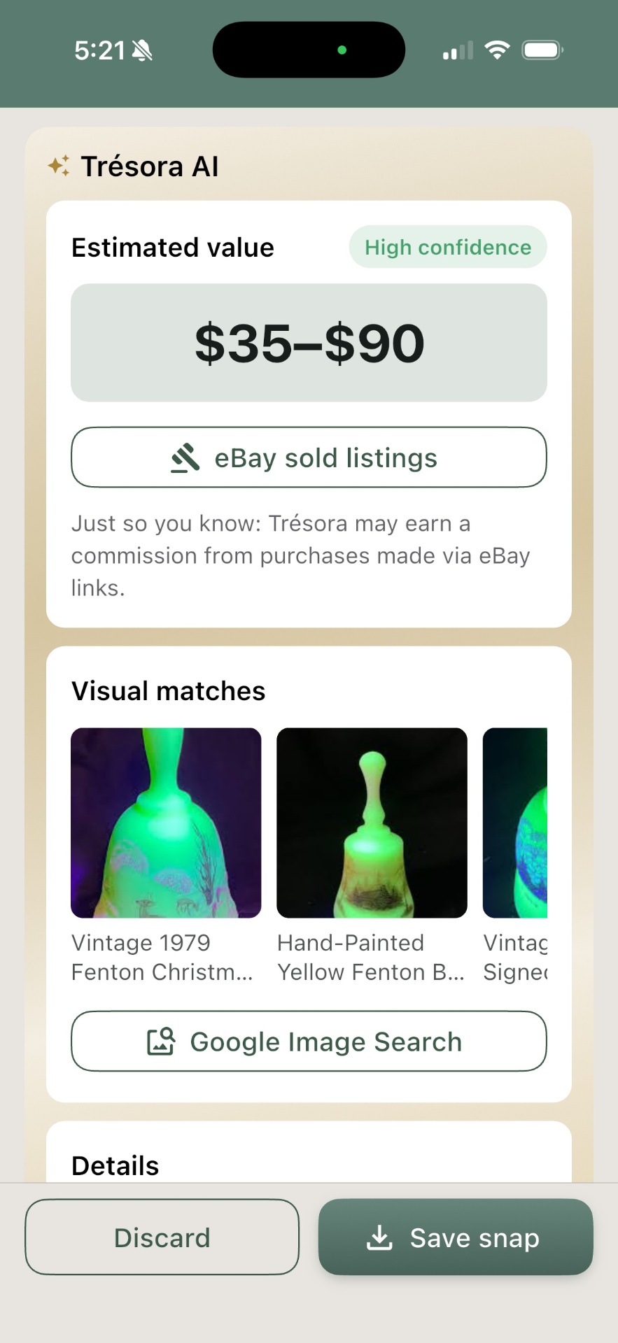
Trésora's "Snaps" feature solves that: take a picture and AI returns what it likely is, a little of its story, and an estimated value. It also provides quick links to Google Images and eBay's sold items — the next two stops collectors usually make when doing this type of research. One tap away — no typing or filtering necessary.
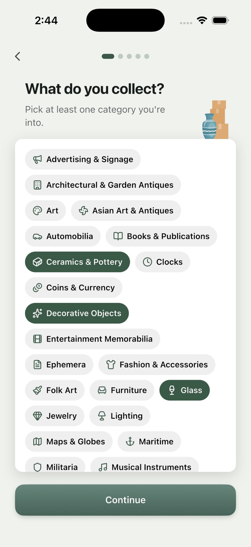
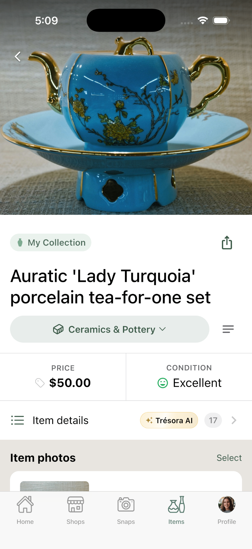
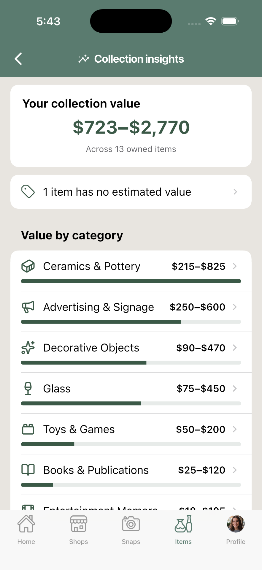
There are honestly many apps that will identify items from a photo. But they're "one-trick ponies." They don't think about what happens after you identify something. In Trésora, you can instantly turn those identifications into structured data about the items. Trésora supports over 35 categories of collectibles, each with a unique set of relevant attributes collectors care about.

One builder, many platforms
The original, abandoned version of Trésora was web-based. Mainly because I had no idea how to build mobile apps at the time. But Trésora needed to be a native mobile app. It needed fast camera tools, GPS location, and cross-app sharing tools. It needed to be fast, intuitive, and simple to set up.
The new Trésora is built on Google's Flutter platform, which is nothing short of amazing. One codebase can work on multiple platforms, but iPhone and Android users have different expectations for look and feel. And an iPad app shouldn't just feel like an iPhone app on a bigger screen.
My design and development process centers around the iPhone experience — the experience I'm most familiar with, as well as the most likely source of most of the app's revenue.
But every week or so, when I've completed and polished a solid batch of updates, I do two deep dives to fine-tune both the Android experience and the iPad experience, so users on those platforms also feel like the app was built just for them.
What I built
A complete native app for iOS and Android — and everything a launch needs around it.
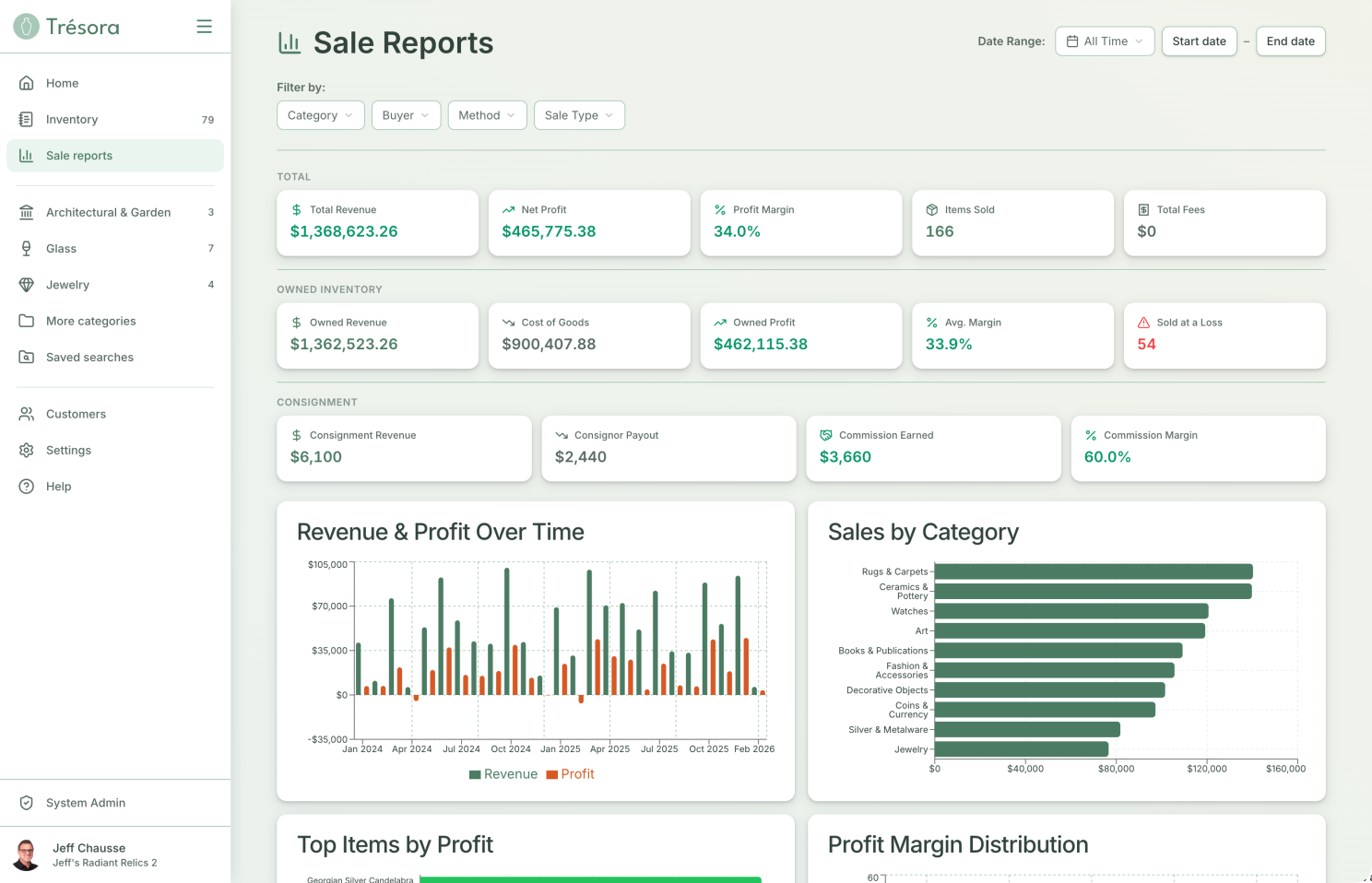
The full hunt loop runs end to end: a camera that identifies an object with AI and estimates its value; an inbox for snapping finds now and sorting them later; a collection that catalogs virtually anything, on a taxonomy of 38 categories with hundreds of attributes. Shop discovery and stop-planning layered on Google Maps; and shareable Guides — hand-built lists of the shops worth the drive.
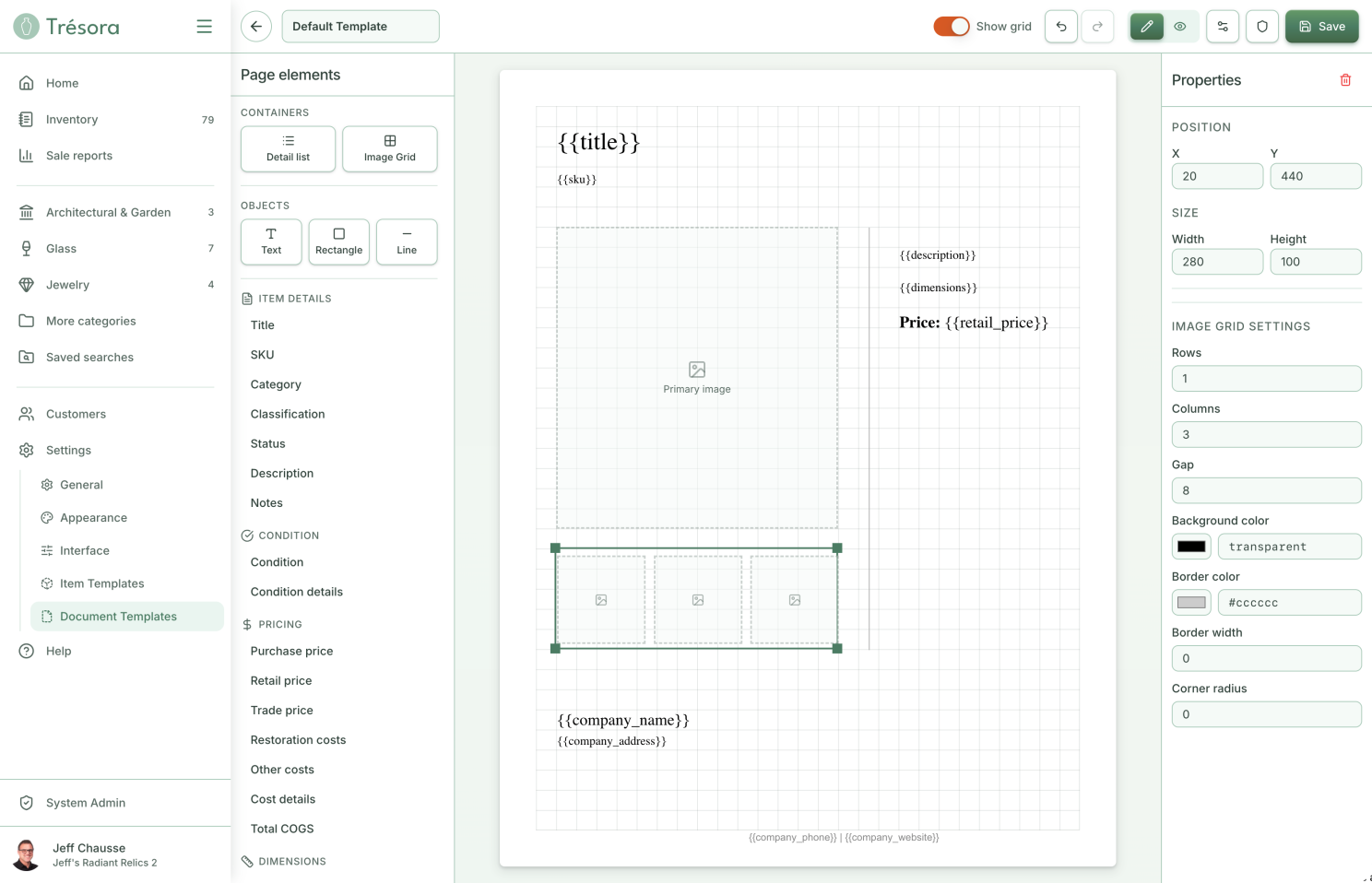
Beneath the surface: a Supabase backend and data model, subscriptions and entitlements handled through RevenueCat, server-rendered share cards, and analytics provided by PostHog. Beside it: the name and the brand, a full light-and-dark design system, the marketing site, the help docs, the support setup. One person, the whole stack.
Tested in the wild
An app that travels with you can only honestly be judged on the move. So Trésora routinely gets tested out where it's actually meant to be used — on weekend collectible hunting trips with my wife, its second and most honest user. The pattern repeats every trip: something that felt obviously right on my monitor turns out wrong in a booth — a button my thumb can't reach one-handed, a flow that requires more mental focus than I can muster while in a crowded flea market. I come home each time with a list of improvements I'd never have thought of while sitting at my desk. Nothing can replace the design insights you get from real use in real environments.
Where it stands
As I write this, Trésora is just weeks from launch. The app is built and field-tested; what's left is the unglamorous connective tissue — help docs, support tooling, the marketing site, the ridiculous amount of setup needed to actually put apps on the App Store and Google Play.
Will Trésora succeed as a business? I don't know. I've never launched something like this. But one thing is clear — I am excited and eager to show this app to the world. I know exactly who needs to know about it and what I would tell them. This is in sharp contrast to the first iteration, where I "finished" the app and was baffled as to what to do next. I didn't know who my user was, or what exactly my message to them should be.
Lessons learned
Building is the easy part now; the hard part is knowing what not to build. That was the real lesson of the false start. AI will help you make anything, instantly, and it will never once tell you to stop. The thing that used to enforce focus — how slow and expensive writing code was — is gone. What's left to enforce it is knowing exactly who you're for, what they actually need, and having the nerve to leave everything else out.
Design judgment is the one thing AI can't do for you. It's also the thing I've spent more than thirty years getting good at. A power tool in the wrong hands just makes it faster to do the wrong thing; the same tool in experienced hands makes the right thing, fast.
I'm a designer who knows what to build — and I can build it, too. For most of my career, that judgment was the main thing I brought to a project — the taste, the focus, the plan — always handed off for someone else to make real. With the power of AI, that's changed. Paired with lessons never forgotten from my early days as a software engineer, I have now proven I can take a product from a vague concept all the way to a polished final product. There are truly no bounds to what I can contribute to any project or team.