
The problem: A mobile thesis without a mobile product
Forrester's client portal was the primary way enterprise analysts and Fortune 500 clients accessed premium research—but the experience hadn't kept pace with how those clients actually worked. The portal was desktop-first in a world that had gone mobile, content discovery required deep familiarity with Forrester's taxonomy, and there was no meaningful native mobile presence at a time when executives were doing their reading on phones and tablets between meetings.
At the same time, Forrester was publicly championing its "Mobile Moments" thesis—the idea that brands win by serving customers in the small, in-context moments throughout the day. The irony was hard to miss: the company defining mobile strategy for the Fortune 500 didn't have a credible mobile strategy of its own. That gap was showing up in renewal conversations, where clients increasingly asked when they'd be able to read research on the go.
My role
As Manager and Principal UX Designer, I owned UX strategy across Forrester's client-facing digital products over five-plus years. That work spanned the Forrester.com client portal redesign, the launch of Forrester's first native iOS research app, a ground-up rebuild of the Forrester Insights Android app on Material Design, a unified React Native platform consolidating multiple legacy apps, and the responsive modernization of Forrester.com itself in partnership with Filament Group.
I worked across Engineering, Marketing, Product, and Customer Success—and partnered with external design and development agencies for the iOS launch and the responsive rebuild. The role required equal parts hands-on interaction design and cross-functional leadership: shaping the mobile strategy in executive reviews one day, then sitting with engineers reviewing iPad split-view interactions the next.
The process
The work spanned five years and several products, but it followed a consistent through-line: meet enterprise clients where they actually were—increasingly mobile, increasingly time-constrained—without compromising the depth that made Forrester research valuable in the first place. Here's how it unfolded:
Aligning digital products with the Mobile Moments strategy
Before designing screens, I worked with leadership to translate Forrester's external mobile thesis into an internal product roadmap. That meant auditing where clients were actually consuming research (commutes, between meetings, on tablets in bed) and reframing each product investment—portal, responsive site, native apps—as a different surface for the same underlying content strategy.
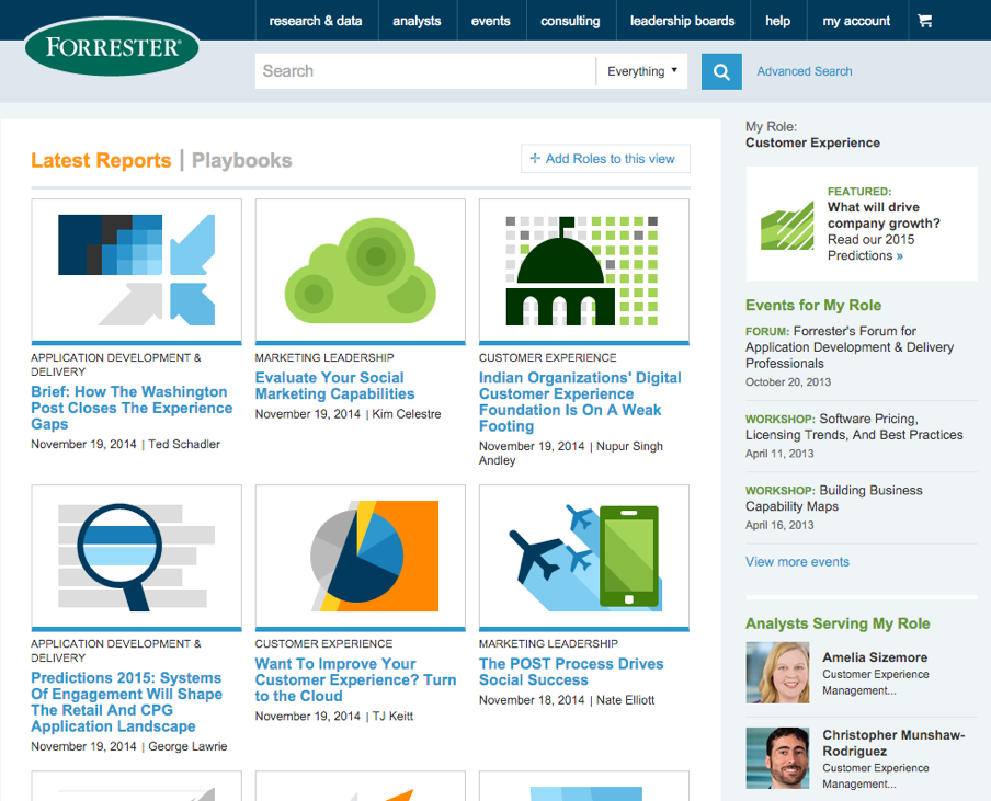
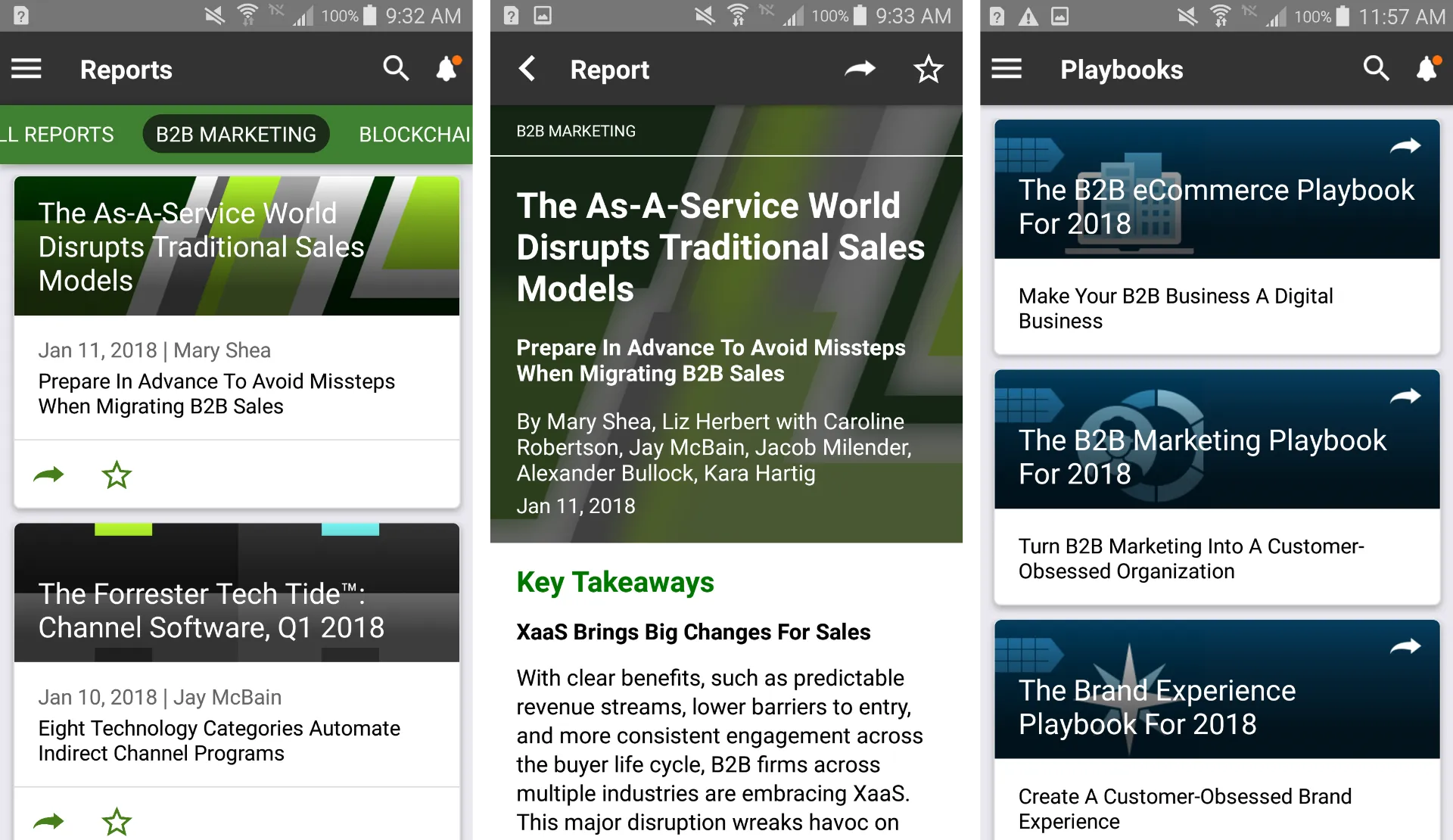
Redesigning the client portal around discovery, not navigation
The legacy portal made clients hunt through a taxonomy. I led a redesign focused on the first-page experience—surfacing relevant research, analyst activity, and personalized recommendations above the fold—so clients could find value in the first 30 seconds of a session. This shift drove a 35% lift in first-page click-through and gave Customer Success a stronger story in renewal conversations.
Launching native mobile, then unifying the platform
We launched the first native iOS app with an external design agency, then I led a ground-up rebuild of the Android app on Material Design, and finally consolidated the fragmented native footprint into a single React Native platform serving both iOS and Android. Each step compressed the maintenance burden while expanding the surface area for engagement—culminating in 30% MoM engagement growth and 3× weekly active users.
Key design features
Across the portal and the native apps, a few design decisions did most of the heavy lifting. They weren't flashy individually, but together they redefined what "Forrester digital" felt like to an enterprise client:
A discovery-first portal homepage. Instead of dropping clients into a taxonomy, the redesigned client portal led with personalized research recommendations, recent analyst activity, and contextual entry points into the topics each client was actively tracking. This single shift—from navigation-first to content-first—was the largest contributor to the 35% improvement in first-page click-through.
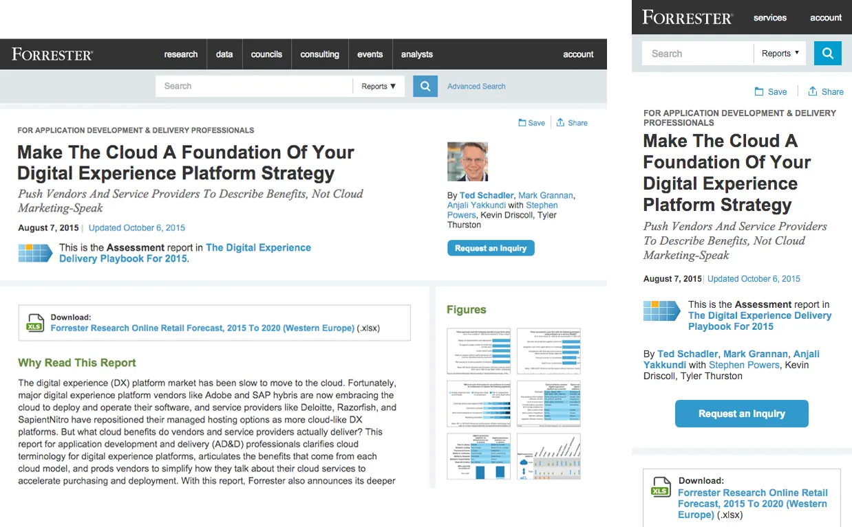
A device-agnostic responsive system. Partnering with Filament Group, we modernized Forrester.com with a fluid, responsive layout system aligned to the Mobile Moments strategy. Research that used to render as a wall of text on a phone became readable, scannable, and shareable across devices—without forcing engineering to maintain separate mobile templates.
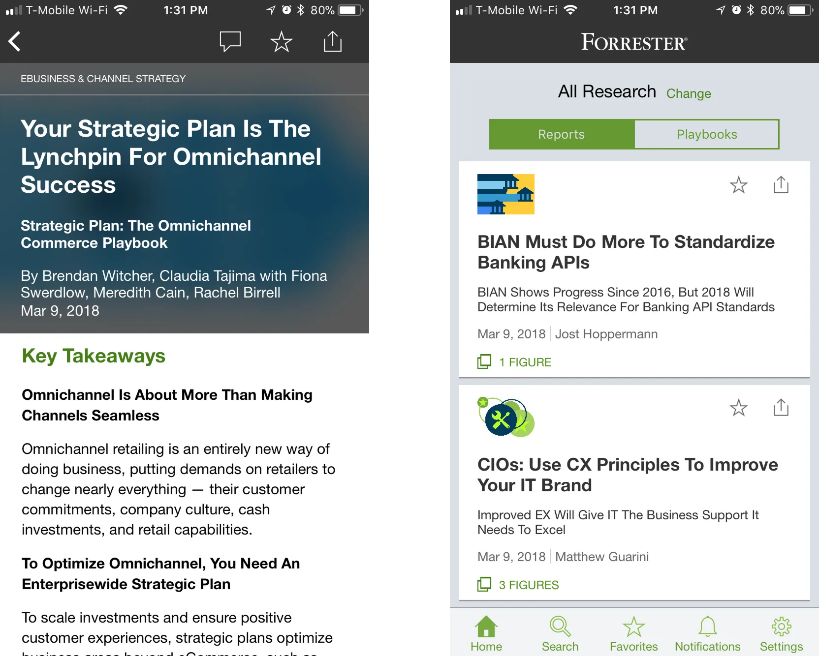
A premium native iOS research experience. For the first iOS app, we treated the phone as a deliberate reading environment, not a shrunken portal. Offline access, a focused reader mode, and analyst-curated reading lists turned commute time into legitimate research time—which is exactly the behavior that drove engagement up 30% month-over-month.
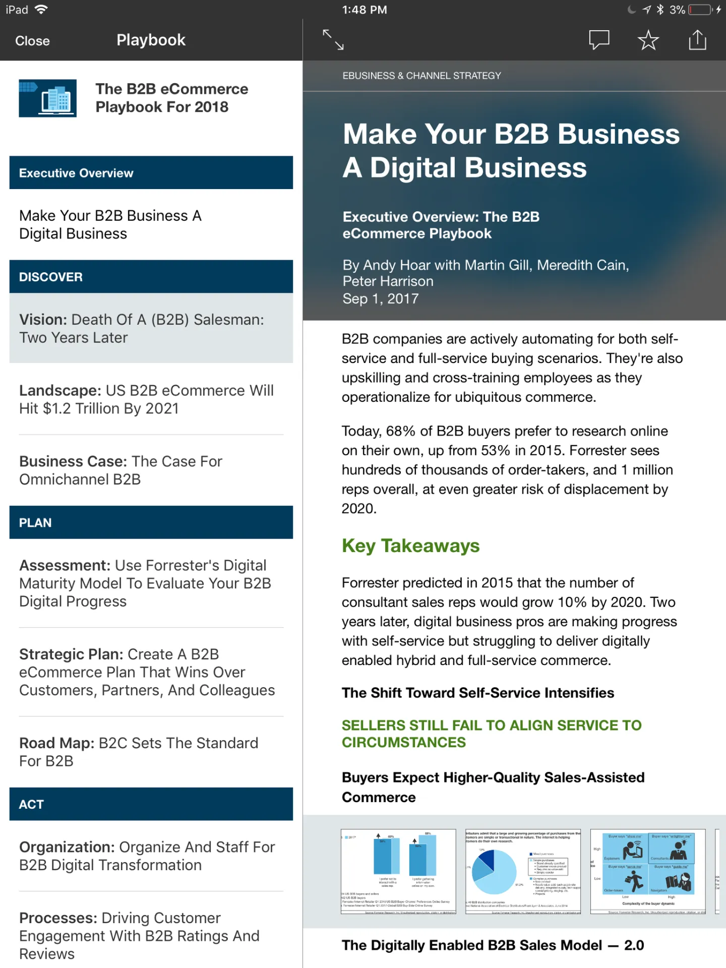
Universal iPad interactions. Evolving the iOS app into a universal app for iPhone and iPad meant designing for a different reading posture entirely. Split views, flexible list/grid navigation, and multitasking-aware layouts let analysts move between a report and their notes without losing context—a pattern enterprise clients had been asking for explicitly.
A Material Design rebuild for Android, then a unified React Native platform. Rather than porting the iOS app, we rebuilt Forrester Insights for Android from the ground up on Google's Material Design framework—an effort singled out in client feedback as one of the most polished research apps on the platform. From there, we rolled the lessons of both standalone apps into a single React Native codebase, collapsing the maintenance footprint and ensuring every future feature shipped to iOS and Android simultaneously. The sequence—native quality first, unification second—gave Forrester a sustainable foundation for the next phase of mobile investment.
The impact
The portfolio of work moved Forrester from "desktop-only research vendor" to a credible multi-surface digital product company:
Client portal: +35% first-page click-through. The discovery-first redesign measurably improved how quickly clients found value in a session—and gave Customer Success a concrete improvement to point to in renewal conversations.
Native mobile: +30% MoM engagement, 3× weekly active users. The launch of the first iOS app and the Material Design Android rebuild fundamentally changed when and where clients consumed Forrester research, with engagement growth compounding month over month.
A sustainable mobile platform. Consolidating the legacy native footprint into a single React Native codebase eliminated duplicate engineering work and made every future feature investment automatically multi-platform—a structural win that outlasted any individual release.
Strategy and product, finally aligned. Perhaps the most important outcome wasn't a metric: by the end of this work, Forrester's client-facing digital products actually embodied the Mobile Moments strategy the company had been selling externally. Sales conversations, analyst demos, and renewal pitches all benefited from products that matched the message.
Lessons learned
Strategy is only real once the product reflects it
Forrester had a sophisticated mobile thesis years before it had a mobile product. The lesson I took from this work: external strategy without product alignment quietly erodes credibility, especially with enterprise clients. The biggest unlock wasn't any single feature—it was getting the product to finally match the story.
Native quality matters more than native parity
Rebuilding the Android app on Material Design instead of porting the iOS design produced a noticeably better experience for Android users—and that quality showed up in engagement and client feedback. Treating each platform as a first-class environment, then unifying the codebase later with React Native, was a better sequence than trying to start unified.
Discovery beats navigation for expert users
It's tempting to assume sophisticated enterprise clients want sophisticated taxonomies. They don't. They want the right thing surfaced first. Reorienting the client portal around discovery rather than navigation was the single highest-leverage change in the entire portal redesign—and the principle has held up in every client-facing product I've worked on since.