Making Firefox more "Chromey" with userChrome.css
I recently made a commitment to try to switch from Google Chrome to Mozilla Firefox, due to Mozilla’s passionate devotion to improving the web both users and developers, as well as Google’s general privacy ickiness. But I’m a very persnickety software user (comes with the job), and the UI chrome (no pun intended) for Mozilla just felt very cramped to me, so I set about to customizing it just how I liked (which happens to mean very Chrome-like).
Firefox offers user themes, and has some easily accessible customization options, but to truly tweak things (and you can tweak almost anything), you need to learn about “userChrome.css” and how to set it up. You can do that at UserChrome.org. Take special note of the extra steps you need to take to activate it on Firefox 69 (and beyond, presumably).
Once you have your userChrome.css file in place and enabled, here are the modifications I used to make Firefox feel more like the Chrome… chrome.
#personal-bookmarks toolbarbutton {
  margin: 0px 3px 2px 3px !important;
  padding: 4px 4px 4px 4px !important;
}

#personal-bookmarks .toolbarbutton-text {
  font-size:12px;
}

#nav-bar {
  padding-top: 3px;
  padding-bottom: 3px;
  padding-left:4px;
}

#TabsToolbar {
  padding-top:10px;
}

.tab-text {
  font-size: 12px !important;
}

.menuitem-iconic, .menu-iconic, menuitem[image] {
    padding-top: 3px !important;
    padding-bottom: 3px !important;
}
Here are the “before” and “after” images of my Firefox UI.
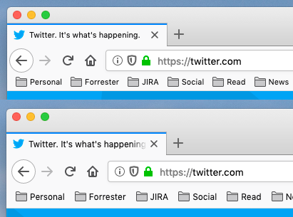
Interestingly, most userChrome.css hackers are obsessed with removing as much whitespace as they can. But I like to give my UI a little room to breathe. This design feels much more comfortable to me.
On a side note, I’m an obsessive window-mover, and the default Firefox UI is very hard to drag around because it doesn’t put any space above the tabs. Fortunately, there is a simple option under “Customize…” to turn on the title bar (like I did), or just add some “drag space”, Chrome-style (Look in the bottom left-hand corner). No userChrome.css needed.